
Electroharmonix
· from English
What is the Electroharmonix font?
Electroharmonix is a typeface by Ray Larabie whose Latin letters are drawn to look like Japanese katakana. Readers of English can read it; readers of Japanese find it very hard.
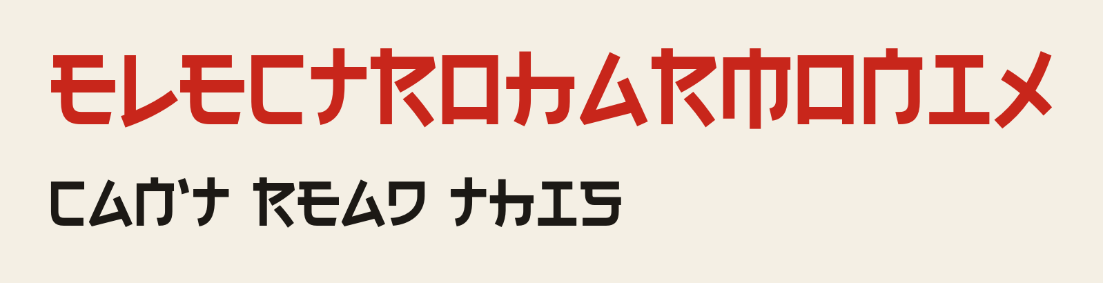
Electroharmonix is a faux-Japanese display font: every letter is an ordinary Latin letter, built from strokes that imitate katakana. People who read only the Latin alphabet see slightly odd letters and read the words after a moment. People who read Japanese see katakana first, and as katakana the text is nonsense, so they have to fight their own reading habit to decode it. The font is a favourite demonstration that reading is recognition of whole shapes and words, not the decoding of single strokes. The same effect explains why learners of Chinese, Japanese and Korean eventually recognise words at a glance without checking each stroke.
Examples
Can't read this (set in Electroharmonix, it looks like a line of katakana)
Kungfucius says: The only font that makes foreigners feel literate in Tokyo and locals feel lost at home.